My Role
Product Designer
Case Study
My Role
Product Designer
Users
DIY beginners and first-time homeowners
Outcome
Designed enhanced experience that improved customer retention in testing
Timeline
10 weeks
Guided Case Walkthrough
Most DIY guidance fails at the moment it matters most, when someone is mid task, unsure of the next step, and has no one to ask. Existing apps send users to YouTube. Forums give conflicting answers. Instruction manuals assume knowledge the user does not have.
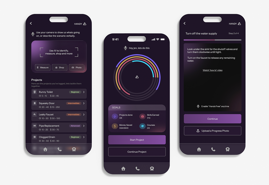
Handy turns a complex AR + AI idea into a guided DIY experience that feels approachable for first time users. A barebones flow already existed, but I rebuilt the product end to end as 0 to 1 work: concept, strategy, core flows, and full interaction model, including how AR overlays and AI generated guidance could work together without overwhelming someone new to the work.
| Metric | What success looks like |
|---|---|
| Customer retention | Designed enhanced experience that improved customer retention in testing. Holding that bar means people return for the next task instead of defaulting to scattered videos and forums. |
| Task completion and momentum | Users move through Start, Prepare, Build, and Finish without abandoning at the decision points where unclear next steps used to cause drop off—not because the task was too hard, but because guidance was fragmented. |
| Comprehension and trust | Instructional language and the transition into AR feel direct and low anxiety, so complexity signals and AI distrust do not disengage people before they begin. |
Primary
DIY beginners and first-time homeowners who need step by step help in the moment, without assuming prior trade knowledge or comfort with AR.
Secondary
Paid professionals who want support with new trainees or complex jobs.
From choosing a project through finishing safely, users need one guided flow. In practice, that means:
I grounded choices in UX/UI best practices, user feedback, and success matrices, and I pressure tested flows, language, and edge cases against what research flagged—project selection, mid task uncertainty, AI distrust, and the transition into AR.
For every major tradeoff, I checked back to the success metrics above: retention in testing, momentum across the four phases, and comprehension/trust signals in copy and onboarding, so the design stayed accountable to outcomes, not taste alone.
| Finding | How it shaped the design |
|---|---|
| Products with highest completion rates delayed advanced features until after a first small win | Led to momentum first structure, AR does not appear until the user is already in motion |
| Drop off happened at three consistent moments: project selection, mid task uncertainty, and AI distrust | Each became a specific design constraint, leading to how to videos, short concise instructional copy, and an always available troubleshoot option. |
| The biggest comprehension barrier was not the AR interface, it was the transition into it | Added a framing step before AR activation so users had a mental model before the first overlay appeared |
| Language signaling complexity caused disengagement before users started | Rewrote every instructional string to use direct, plain language, measurably improved comprehension in testing |
I mapped the full journey from project selection to safe completion before finalizing UI structure.
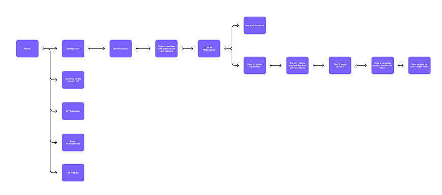
Reusable templates and component patterns let the system expand without redesigning the full journey.
I make design decisions based on UX/UI best practices, user feedback, and success matrices. I grounded choices in the success metrics in Overview, the research findings above, and what we saw in testing. Each row pairs what we decided, why, and what we observed.
| Decision | Rationale and tradeoffs | What we saw |
|---|---|---|
|
Expand AR beyond troubleshooting into guided learning. AR was designed to support more than step by step troubleshooting, users can also look up product information, understand likely causes, and learn about the issue in context. |
Rationale: Testing showed users wanted to do more than fix a single step, they wanted
to understand what they were working on and make better decisions during the task. Trade off: Adding educational and product context layers increased content scope, but made the experience more useful, trustworthy, and repeatable across tasks. |
AR onboarding pattern, guided user through the first experience to avoid early drop off for users unfamiliar with AR. |
|
Goal-oriented workflow with visible progress tracking. The flow was structured around clear milestones, with persistent progress visibility so users always knew where they were and what came next. |
Rationale: Testing showed users were more likely to complete a task and start a new one
when they knew their progress was being tracked. Trade off: Required tighter state management and progress logic, but it significantly improved completion confidence and repeat engagement. |
Four phase journey (Start / Prepare / Build / Finish) proved stable across every project type tested, from plumbing repairs to furniture assembly. |
|
Rewrite all instructional copy to plain language. Every prompt, label, and guidance string was rewritten to remove technical and feature marketing language. |
Rationale: Phrases like "analyzing your environment" signaled complexity and caused
hesitation. "Point your camera at the wall" did not. Trade off: Copy required significantly more iteration than the UI, but comprehension scores in testing justified it. |
Rewrote every instructional string to use direct, plain language, measurably improved comprehension in testing. |
|
Reusable templates and component patterns. Let the system expand without redesigning the full journey. |
Rationale: Modular step templates adaptable to different DIY categories. Shared components for prompts, confirmations, and progress states. A recommendation framework designed for future personalization. | Scalable component system designed to extend across additional project categories without rebuilding the foundational interaction model. |
Chapter 1 of 6
Explore more projects


 Pause
AI powered mental health platform with a clinician in the loop data layer. The design challenge was making AI feel trustworthy in a high stakes clinical context.
Pause
AI powered mental health platform with a clinician in the loop data layer. The design challenge was making AI feel trustworthy in a high stakes clinical context.
